
C.M.Y.K.
2022 marked 10 years of Behind This Wall. The bar only came into being in 2016, prior to that we shape-shifted through London’s outer-rings of music, drink and design. Knitting the story together as we went was the iconic workings of Shutupandance, helmed by David Matos. This collaboration between David and Alex is the cornerstone of what’s been built (and taken apart) over the past decade. To toast this landmark the two of them sat down for a chat to piece together this legacy in conversation and images.
A Let’s start two years before we began working together. I think I was working at a label and you offered to improve the branding on email. In my mind I remember you basically saying it was a bit pants and you could make it better! I replied saying that that project was going on ice for a bit but that I liked your style/output (& cojones!) so if I ever needed to do something else I’d write to you…
D Right! I’ve tracked the very first email sent to Moscow Records, it reads Aug 2011. I was living in the Canary Islands, shortly after quitting my unfortunate incursion into the fashion industry in Barcelona and needed to gather good projects and people to collaborate with as an independent provider. I was already working with a few major electronic labels in Germany (inc. Mille Plateaux and M-nus) and had some decent work to show — that’s how I approached you.

Our first collaboration however happens already in 2012, with the visual identity for Laika Grama, the label that never was. We came up with a parody of His Master’s Voice dog and gramophone.
Behind This Wall is first mentioned right after that and you essentially suggest that I assume the creative direction of (everything visual for) the brand. I was very happy with it.
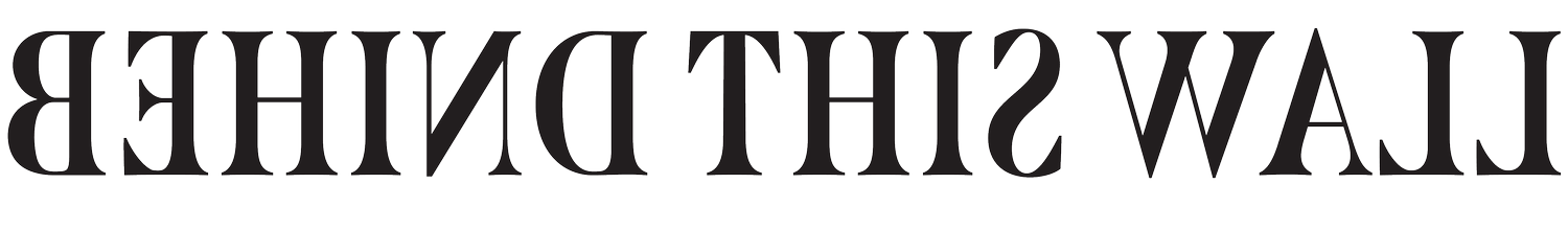
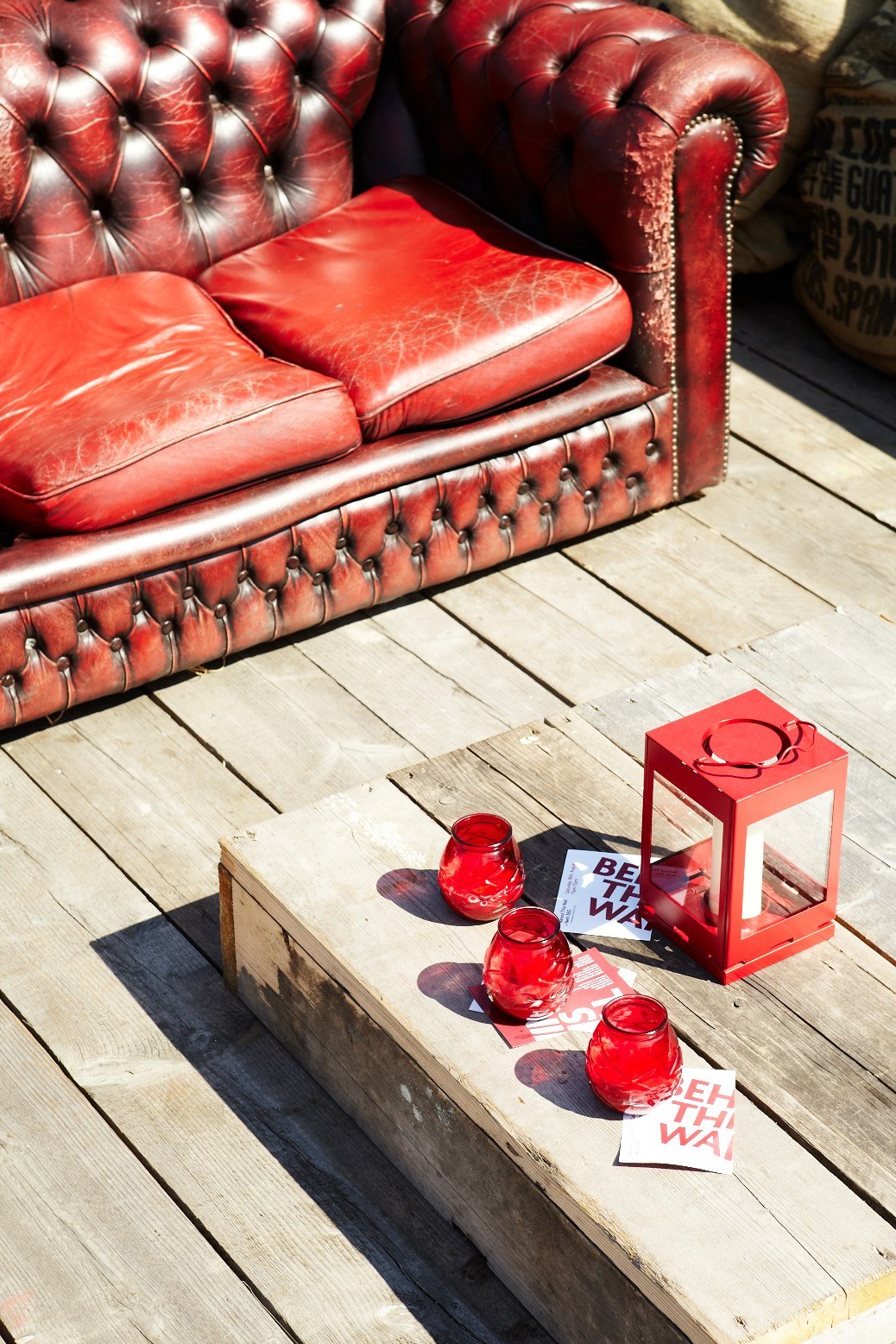
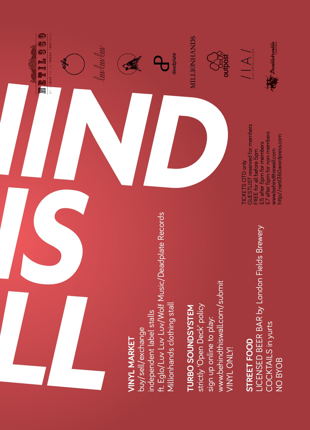
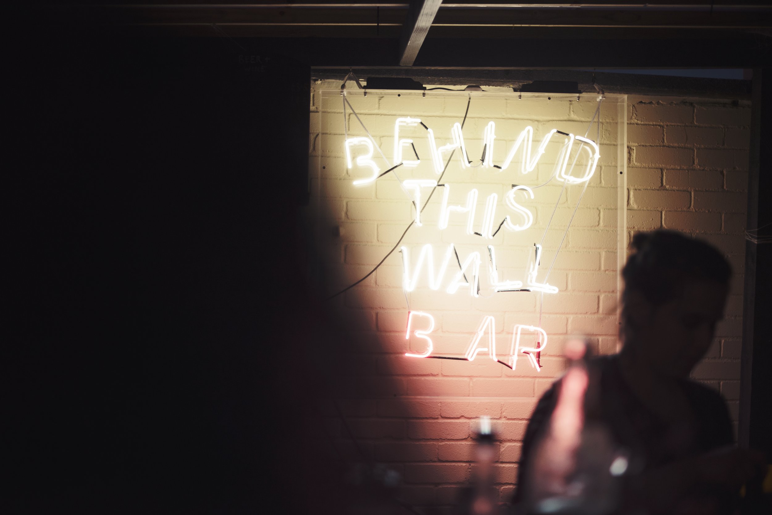
A That’s right! I had this three pronged idea of label, events and some kind of agency that never got beyond fleeting concept. Laika Grama was going to be the label (although one of the tracks ever got finished) and Behind This Wall was for the events. This led to the pitch for the original BTW event and branding. The one on the roof with a vinyl market etc; you delivered this wrap around text that looked like it was lifted off some graffiti and then compacted into a 2D setting with block colours. It was such a perfect visualisation of this rambling Skype chat that we had had, where I mentioned that the name was pinched from a bit of grafiti I saw every day on my way to work.
D The stuff for Netil × BTW, yes. It feels way too clean, looking back. But the corner concept was fitting and the flyer looked cool. It was all before we went wild.

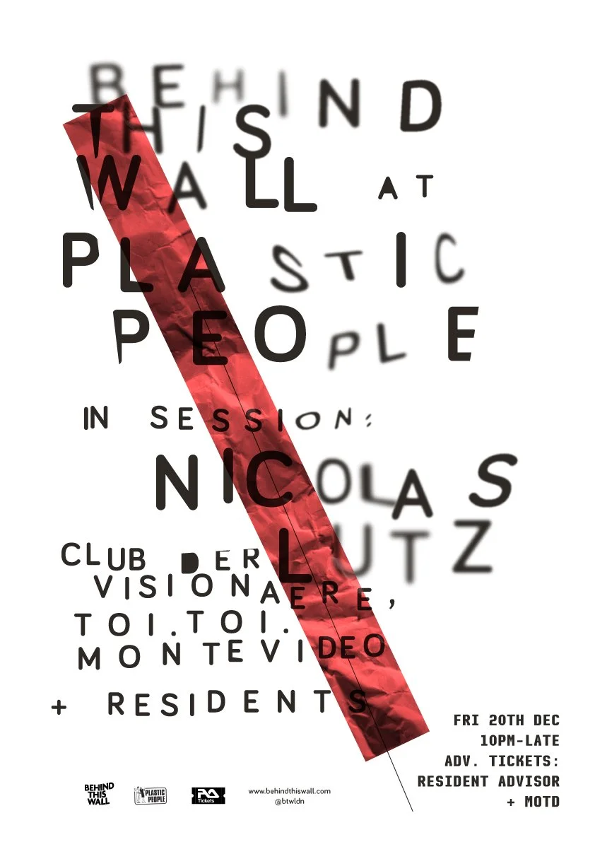
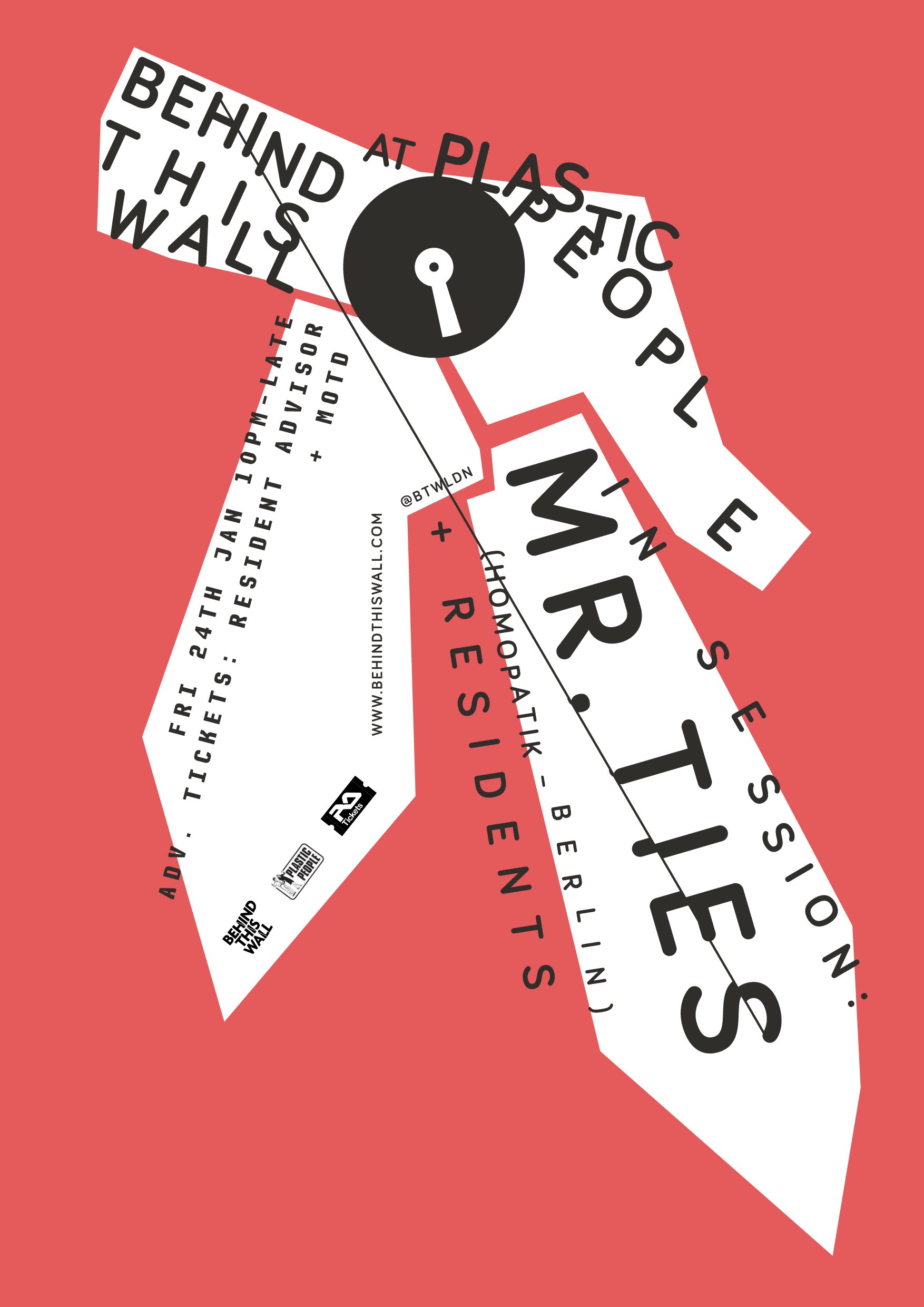
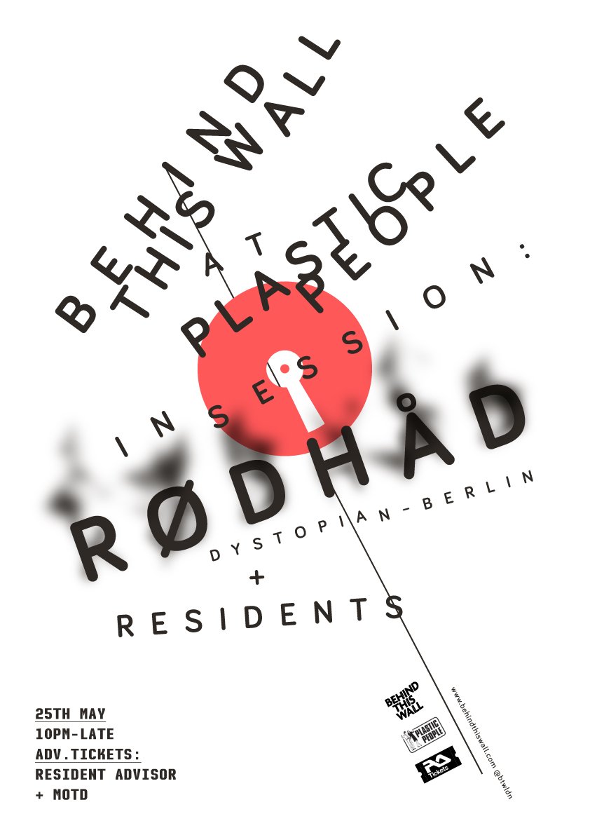
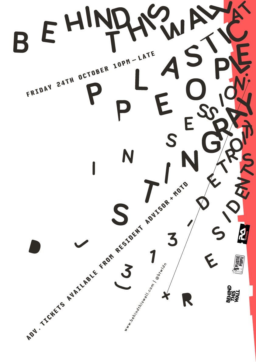
A From that we did a couple of free parties and then secured the Plastic People residency which led us down this risograph route with Hato Press. We really hit our straps with the Mr Ties, Rodhad & Stingray posters where the text and shapes went totally freeform having been quite regimented to start (based on old New York rave flyers).
D And so we went wild! The series for Plastic People took inspiration from the old techno visuals, British punk and contemporary Berlin, along with minimal (and maximal) handmade glitches. The poster for Nicolas Lutz is probably still my most published and shared piece of work to date.


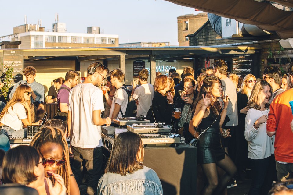
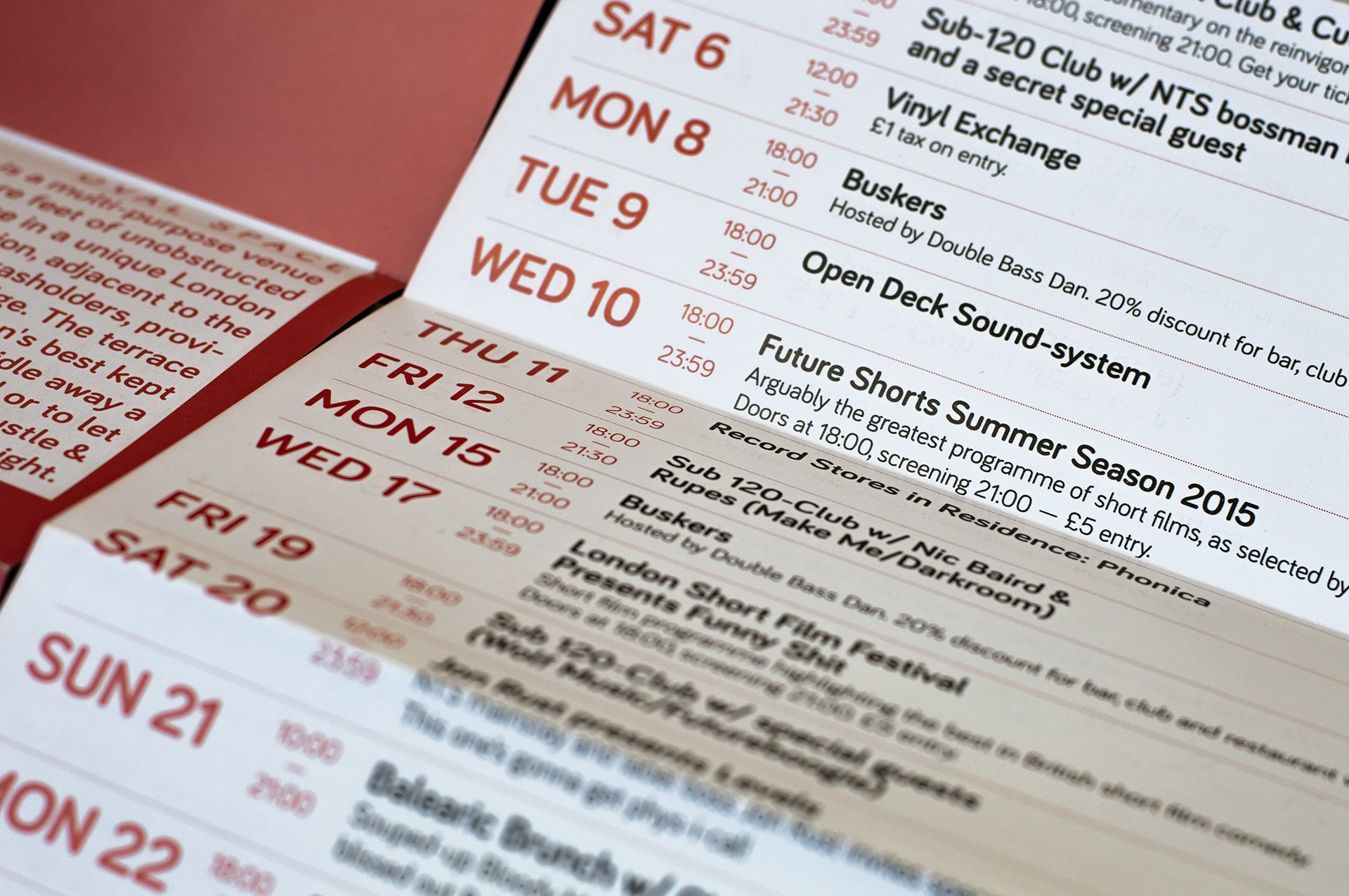
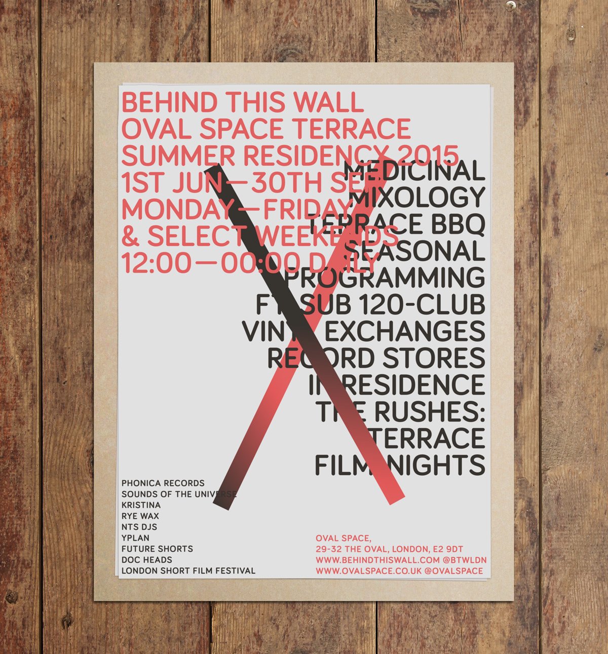
A Sadly, the club closed at the end of 2014 after we’d been there for 2 years, I moved to LA, Alex and Digby went to Berlin and seemingly that was that. But then I pitched the idea of the terrace to the guys at Oval Space in a meditative moment from my little condo in Santa Monica — for a whole terrace takeover with music, film and hospitality (on a craft spirits wave that was really taking off in California hand in hand with the vintage hifi thing). They bit, I came back to do it and suddenly we were going from this very clear, defined (if slightly chaotic) imagery for the rave posters into something super chaotic that needed to be very clearly defined as there was so much going on! The opening times were inconsistent to fit around the venue's programming, our listings were constantly in flux…
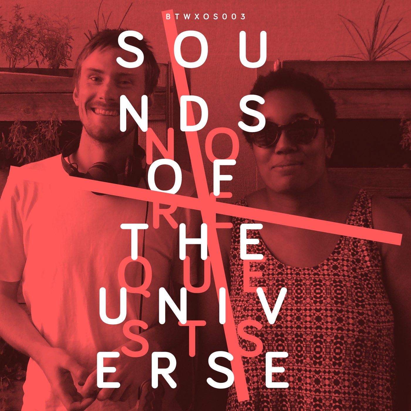
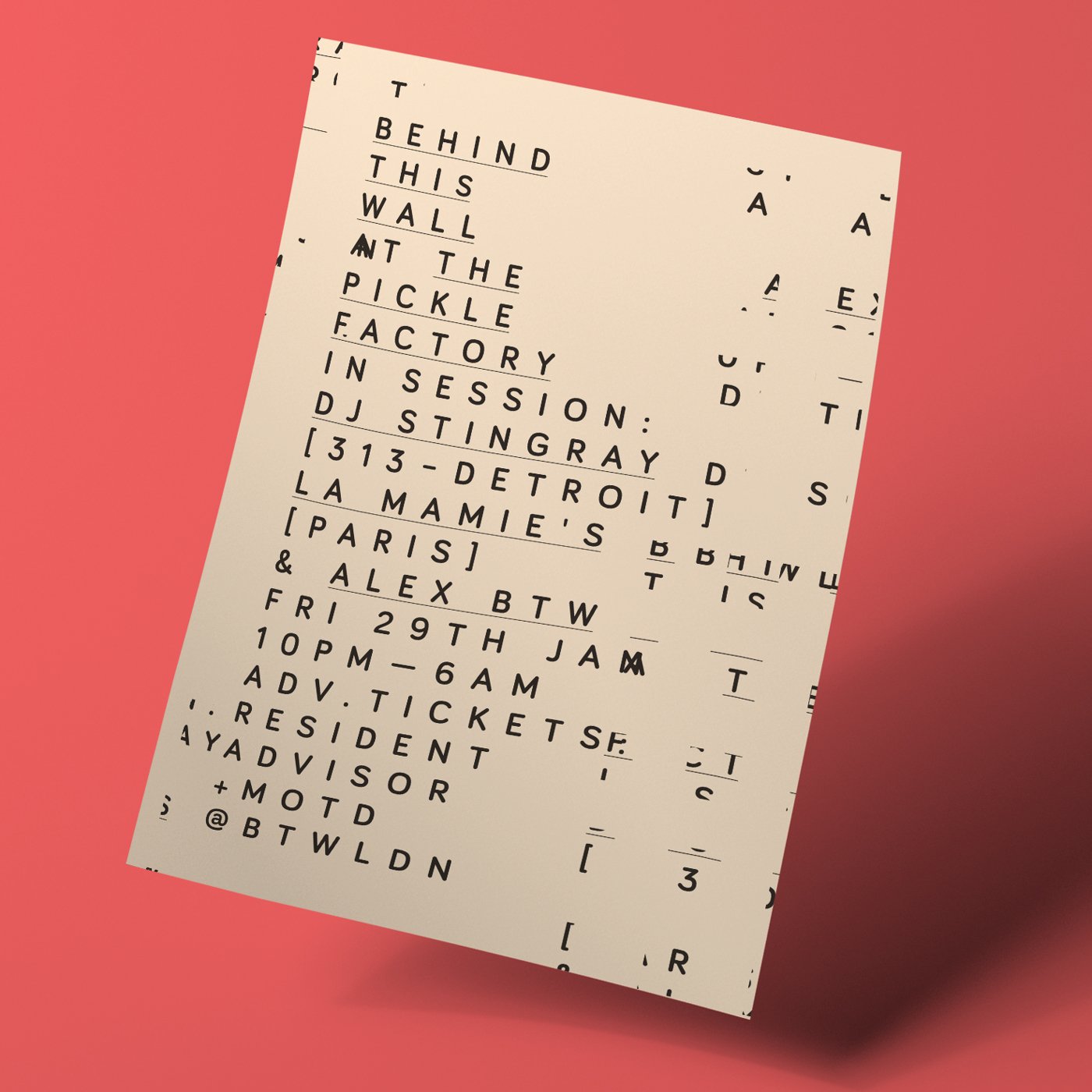
D There’s a lot to thank to those meditations and dreams of yours! True, we had to come up with highly informative, readable material to accommodate huge amounts of information with event descriptions and timetables. We’ve produced a lot of stuff for Oval Space, from posters and weekly programmes and socials to a big itinerant (not so much) lightbox! And of course, the (also weekly) No Requests Mixtapes.


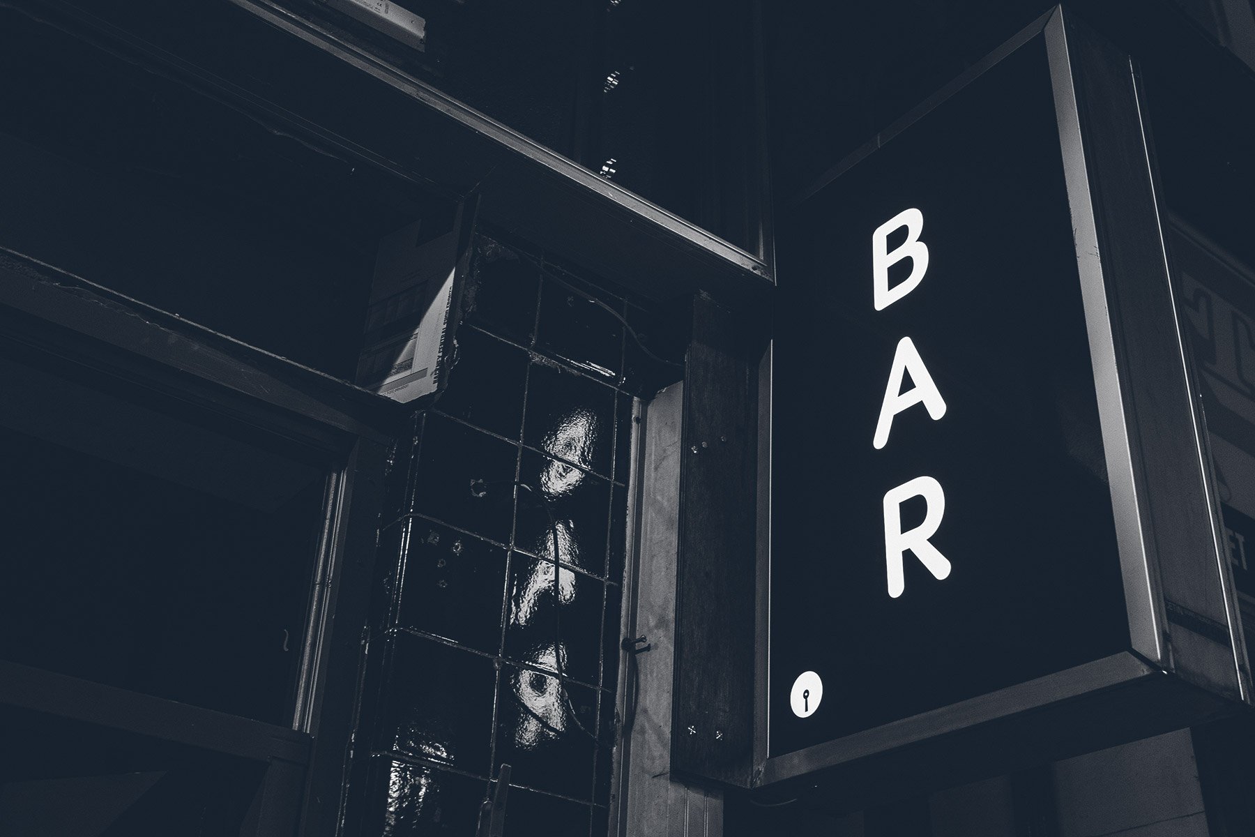
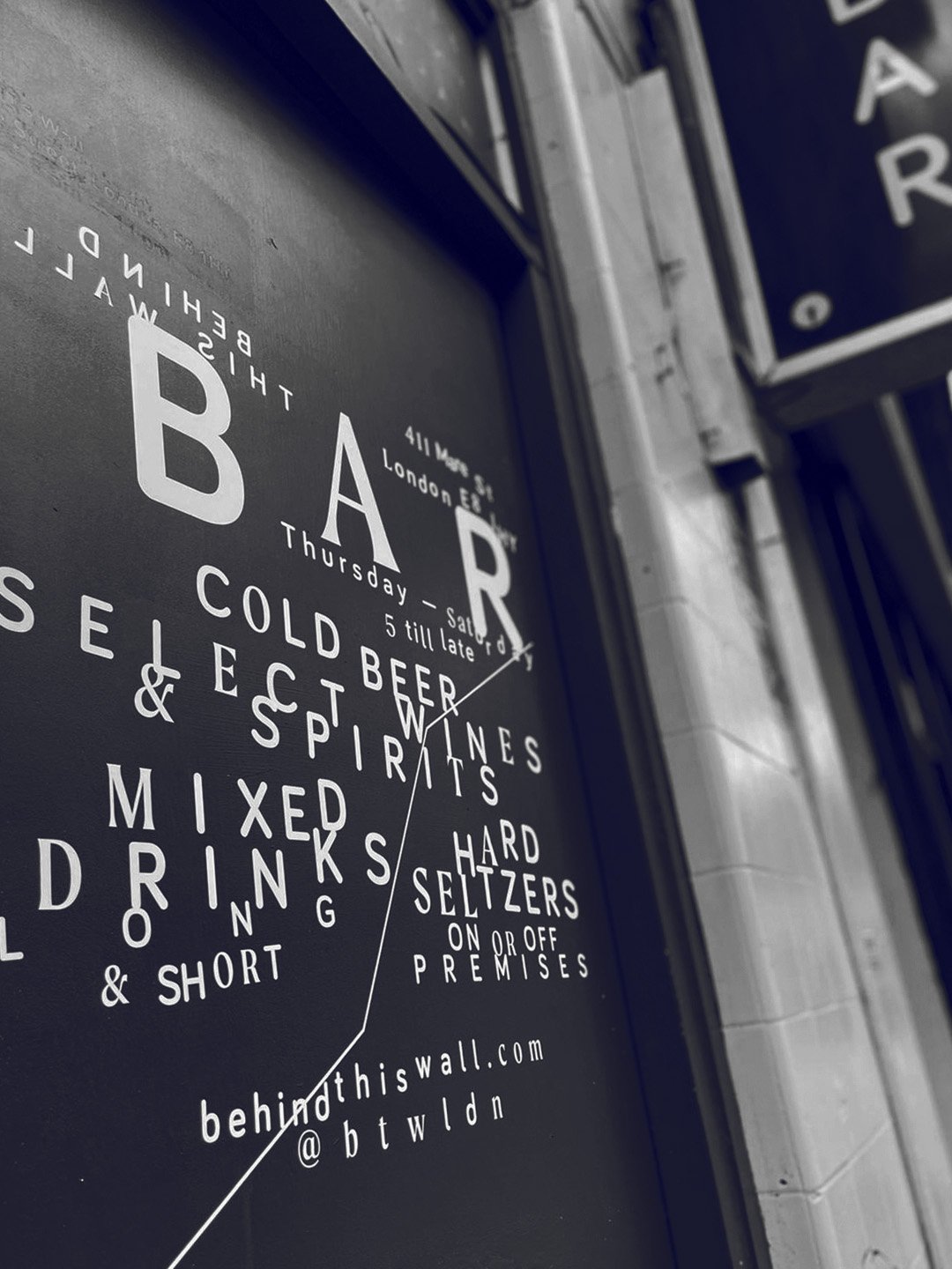
A At the end of that summer, on a personal level, I’d been through it all physically and emotionally. To make that thing work I was literally the bar manager, the carpenter, the bin man & the gardener, with Silv managing all the promotions and events, everything on a screen. But we had built this amazing new team and we wanted to continue with them as a priority. The opportunity for the bar came up from connections to the terrace and it seemed like another impulsive ‘yeah let’s do that’ move that made sense in my head but was maybe harder to convey to our audience. The terrace had had dance music at its heart but now everything was condensing into a drinking concept with a vintage hifi element. I seem to recall most of our design discussions involved the wonky toilet light (which sort of linked the old to the new). But the re-brand you delivered was very sleek, quite restrained and I don’t think I appreciated at the time how considered that was for engaging an entirely new audience who had no interest in the fact that we’d been a club night at Plastics.
D The toilet neon, damn thing! An icon, nonetheless : ) You’re right, it can be cruel (and frustrating) to come up with something visually restrained, not immediate, exciting. Seems neglecting. And on paper things tend to look even worse. But with the brief we had for the bar, a careful approach with enough room for uncertainty seemed clever. Filling that space is what we’ve been doing since then, unapologetically changing things (from typefaces and palettes to the logotype itself) as needed, improving (and adding to) the brand with each new step. Paradoxically, that’s what holds it together — a quite cool achievement.
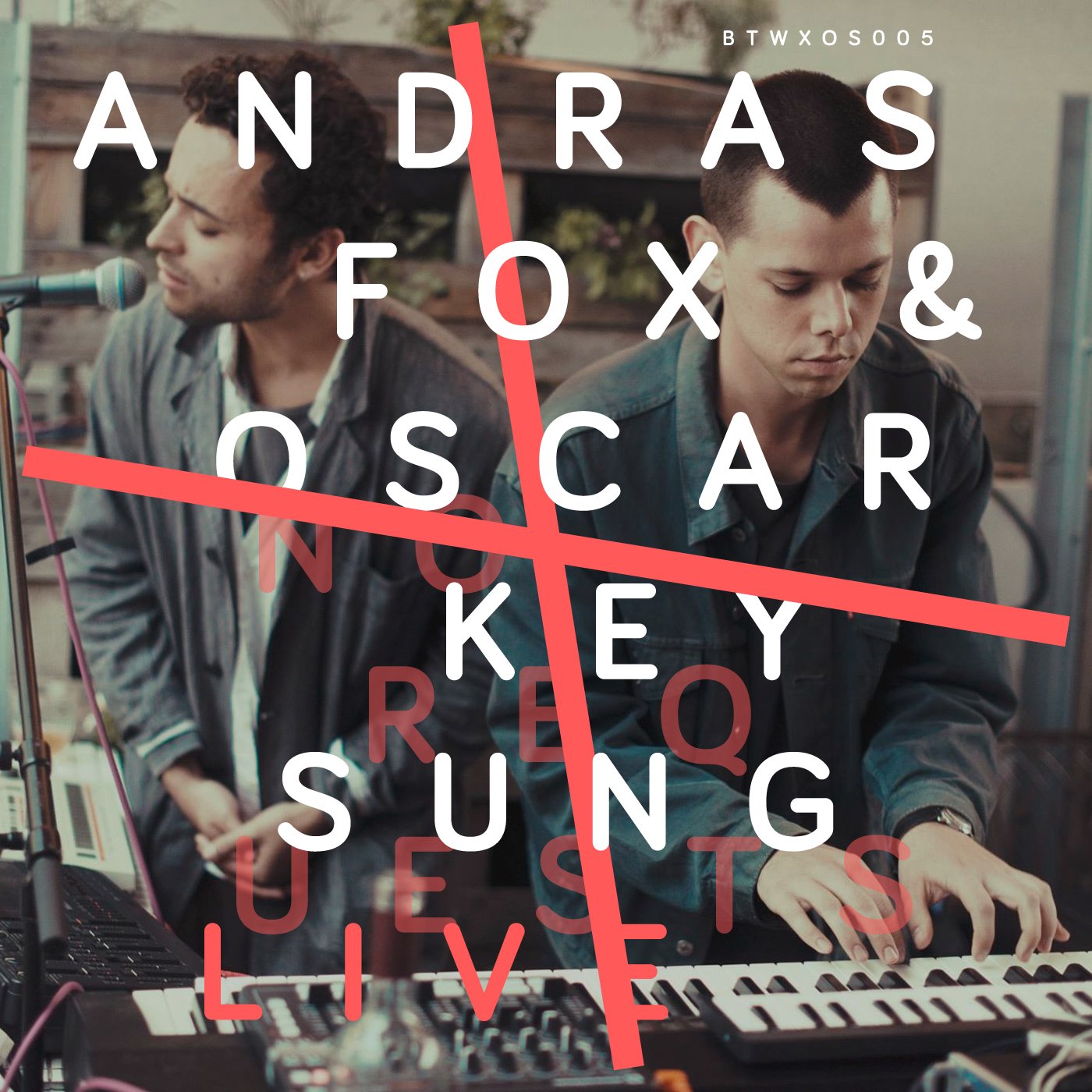
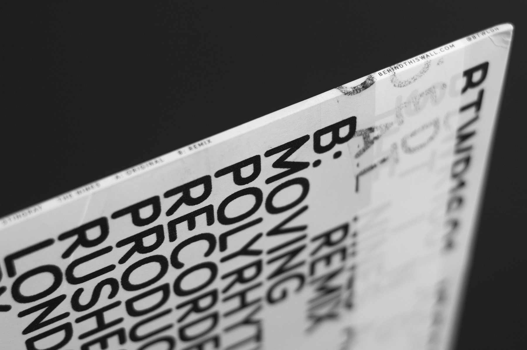
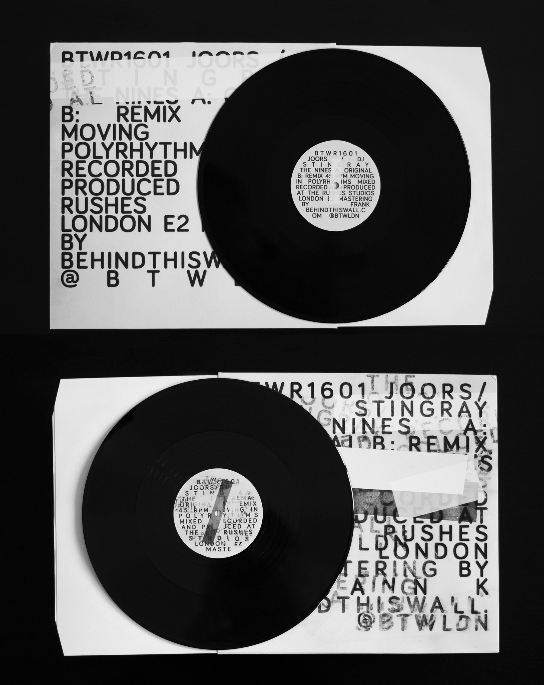
A And then, parallel to this, I wanted to put out some records that we’d been sitting on from the parties (not the Laika ones). This went to the super iconic Stingray album cover. Another total 180 turn but such an amazing piece. To have that physical item always felt like such a goal. It was in hindsight too much at once but again it made sense to me and I feel your visualisation was holding it all together. There was a day in Jan 2016 where we did NTS with Stingray in the afternoon, had the soft launch for the bar for the first time straight after with Sherard (Stingray) supping martinis, then did a record launch party at Pickle Factory where Moodyman showed up and played unannounced — I got to close it out 4-6 and I remember leaving the club at 6 to let in some plasterers to finish at the bar and thinking this is the best day of my life.

The record took a year to actually come out after that because it was impossible to ride so many horses at once, having it in our hands felt like a validation for all the work. The bar was suffering at that stage but this was like a victory lap for what the club night had been.
D That’s so good! It’s a delight to help build (and tell) this story. Oh, and I proudly display that record in my living room, too.
There’s two more things worth mentioning here: the many drinks launched by BTW and the seasonal menus, that I place among the best pieces/series we did along the way: they would connect the actual bar and service (readable and reliable) on the front to the whole story of the brand (glitchy and inspiring) on the back.
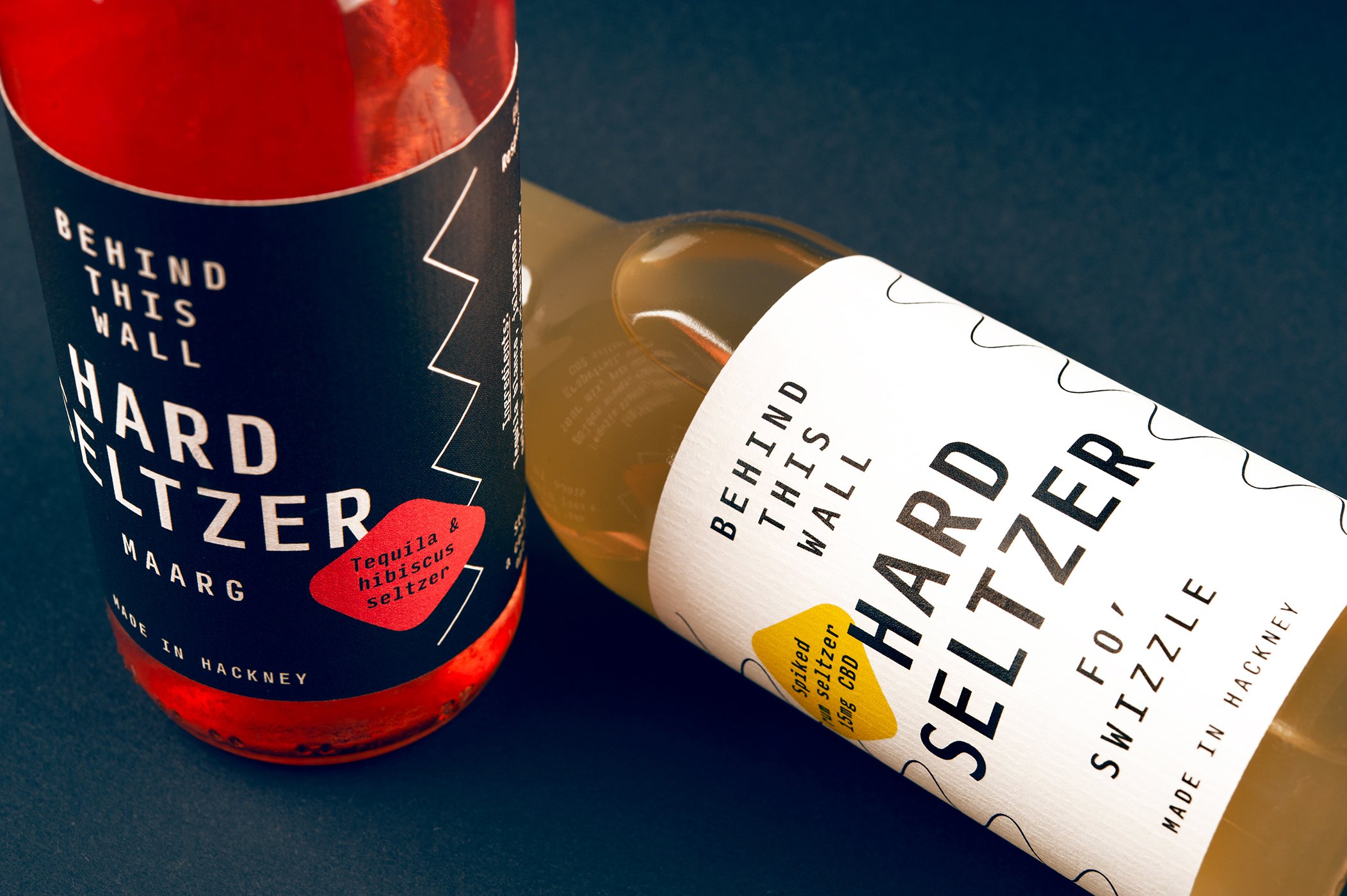
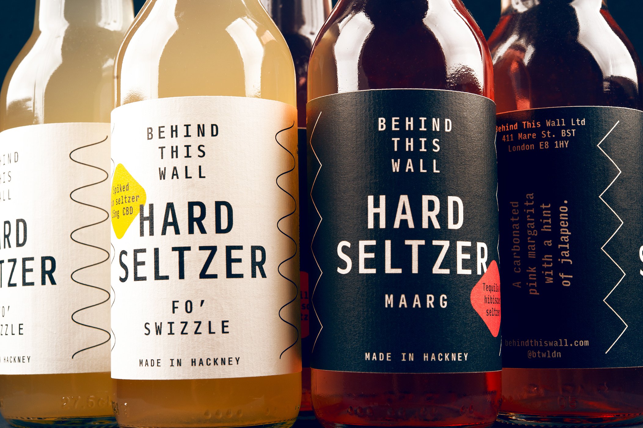
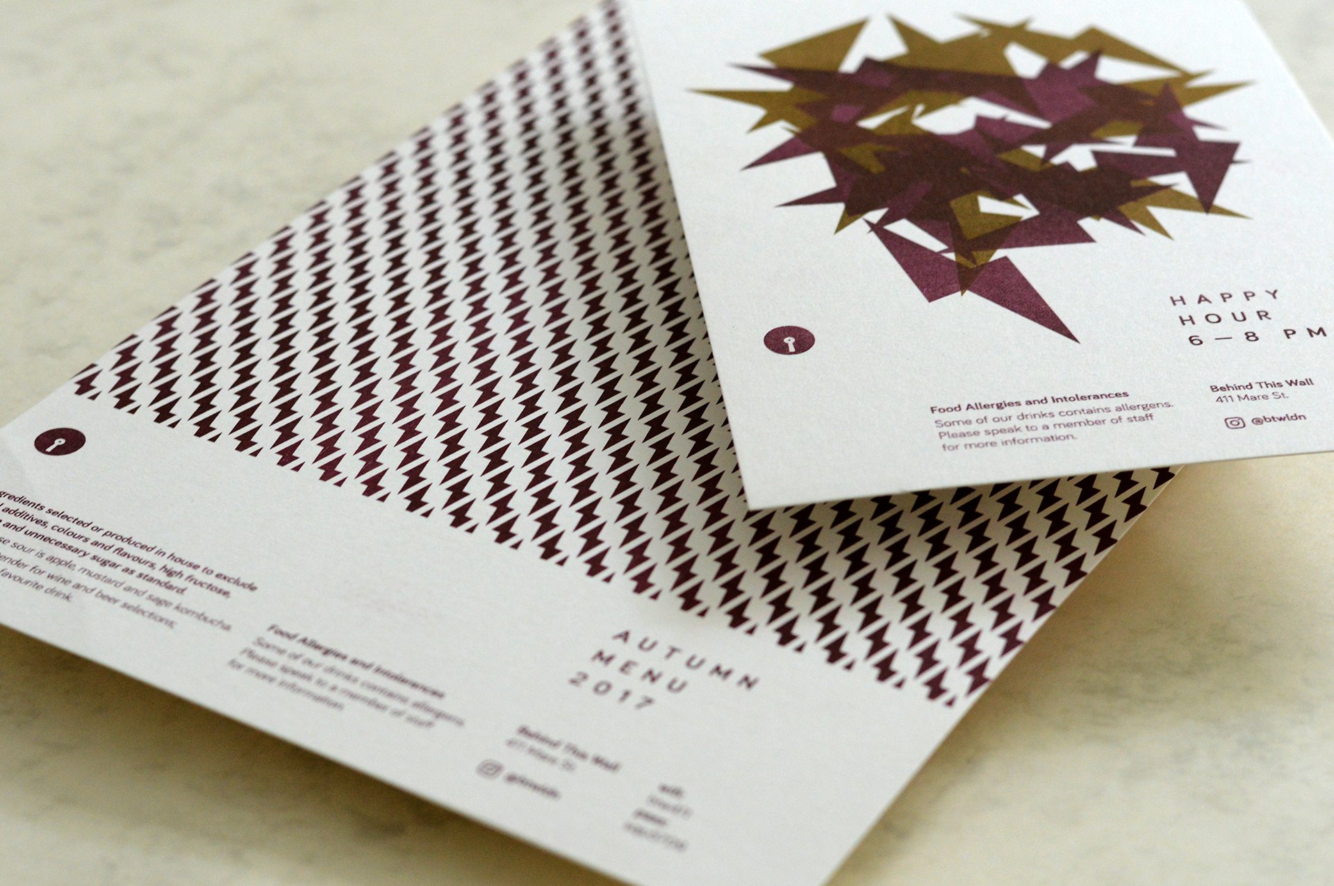
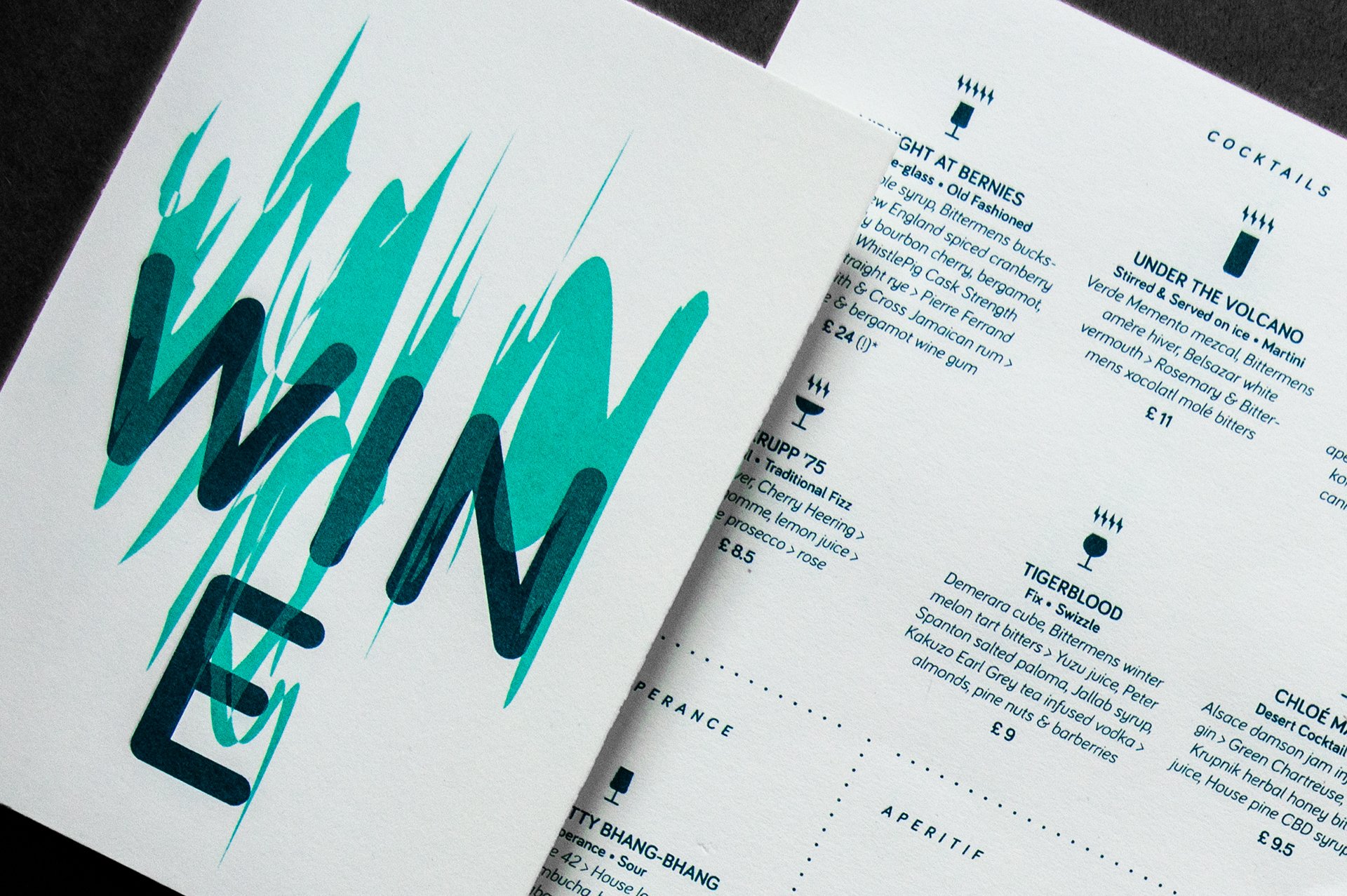

A Sadly now we don’t even have a menu! I know our customers really miss those but really we’re now just doing what we always were; our versions of classic cocktails, but more built to taste. The menus certainly lead our audience to this place and a few regualrs still lament for them. I guess now with the bar branding we’ve mad more space without the menus — we’ve recently updated and sort of linked back to those halcyon ‘wavey’ days. Moving away from the structure into something again a bit more playful with the text.
D Let’s play!